A logo is a set of visual elements put together to be used to assist and build public recognition and Identity for your brand. Logo design mistakes are very common during the process of your company’s visual identity. Through the years of experience in the Design Industry and worked with some of the greatest minds of the trade, we have been through success stories while also struggling through downright fails during the journey.
Among a lot of things that could go wrong, here are 10 of the most common mistakes which, if corrected right at the beginning, will save a lot of your blood, sweat, and time.
So let’s jump in right away!
- 1. Don't assume that the client is familiar with your business
- 2. Don't fall for plagiarism
- 3. Don't use the font as a visual identifier
- 4. Don't use Ornamental graphics
- 5. Don't use raster images in your logo
- 6. Don't use colours that fight for attention
- 7. Don't use all CAPs
- 8. Don't use long-winded tag lines
- 9. Don't use 3D
- 10. Don't be too literal
Here Are The Top 10 Mistakes and How You Can Avoid Them
1. Don’t assume that the client is familiar with your business

While you may know and understand what your brand is about and what you are going to be delivering to your clients, assuming that they already know about it is going to make you ignore a lot of intricacies that might absolutely destroy your marketing efforts.
Having the right kind of shapes and forms on your logo plays a very important role in understanding your business and its core values. So be very specific about what you want to portray and convey only that to your logo designer.
2. Don’t fall for plagiarism
It might be tempting to follow the mainstream media and success stories of well-established brands, but doing so is equivalent to putting your brand into the “That’s a sad rip-off” box. You don’t want to be there.
While trying to be original, logo design mistakes are bound to happen. Get inspired, but don’t copy. Even if it was unintentional, if your logo looks similar to another company’s; it is going to sabotage all your attempts at reaching your customer (Marketing). Apart from it being illegal, chances are, you’ll lose a lot more than you can get.
3. Don’t use the font as a visual identifier
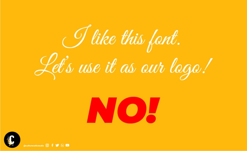
Fonts come in various sizes and shapes. Creating a visual identifier (a.k.a. Logo) that is just a fancy font that you like is not going to give you the impact you think it will. Fonts are after all used for content publishing purposes; it is best left there to avoid any logo design mistakes.
Should you, by no other choice be left with using a font, be sure to make obvious changes to it so it works as a visual identifier by itself.
4. Don’t use Ornamental graphics
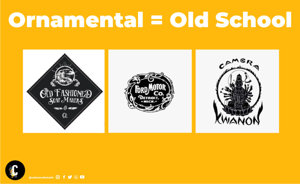
Ornamental graphics which is also known as Decorative graphics are outdated. It used to be the notion that the more decorated a logo composition is, the more premium or value-added it is. That is an inaccurate assumption.
The future is going minimal. Think clean, simple, basic, essential, fundamental, and impactful shapes for your logo design. It will definitely help increase the Brand value to a great extent.
5. Don’t use raster images in your logo

Raster images are files that, when zoomed in, break into pixels. The most common examples of such files are .jpg/.JPEG/.png. Some raster-based software examples are Adobe Photoshop, Corel Painter, Sketchbook Pro, and GIMP. DO NOT USE THESE TO MAKE A LOGO.
Always remember to get your logo made in vector-based software, like Adobe Illustrator, Sketch, Affinity Designer, Corel Draw, Inkscape, etc.
A photo of you or your favorite icon on your logo can turn against your efforts at creating a memorable brand identity. It will make your brand appear more generic than serving a set purpose or niche.
Not only this, but it also makes your logo practically difficult to execute since:
- Having a multitude of colours makes it difficult for the fabricators (Interior decorators/ signage designers) to design a clean cut-out style of signage (these are also called exterior back-lit sign boards).
- Logos are meant to be scalable to any size. Imagine your logo being used in the tiniest of spaces and also blown up to the size of a building. Will a photograph be scalable to such extents? We guess not!
- A shabby/pixelated logo of you brand is the last thing you want to se. It negatively impacts the customer, which means losing them, thereby losing money.
6. Don’t use colours that fight for attention
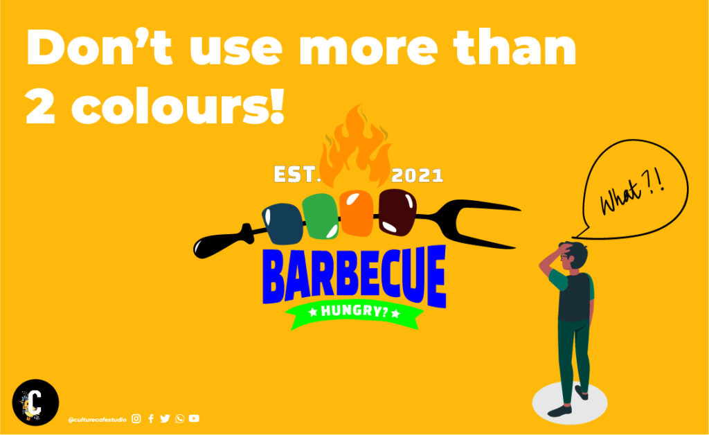
In simple words, the wrong colors are the most common logo design mistakes one can make. The colors you use must connect your brand to your customer. Having two or more strong colors within a single subject will lead to disorientation.
Anything more than 4 colors on a logo is trying too hard. “Less is more”; a quote that is made famous by the designer and architect Ludwig Mies van der Rohe, stands very true to date. Fewer colors coupled with minimal and impactful shapes will give you a logo that will stand the test of time.
7. Don’t use all CAPs

It simply feels like you are shouting to everyone out there and feels intimidating. While it was considered ideal 10 years ago, things have changed. A mix of uppercase and lowercase would be an ideal bet as it makes the brand feel more approachable.
8. Don’t use long-winded tag lines

Taglines or slogans for your business give you a chance to be able to explain what your brand does in a split second. That means you need to create an impact and a strong impression that leads to a good brand recall. All of this needs to happen in a fraction of a second. So, the best practice is to keep it short, simple, likable, and memorable.
9. Don’t use 3D
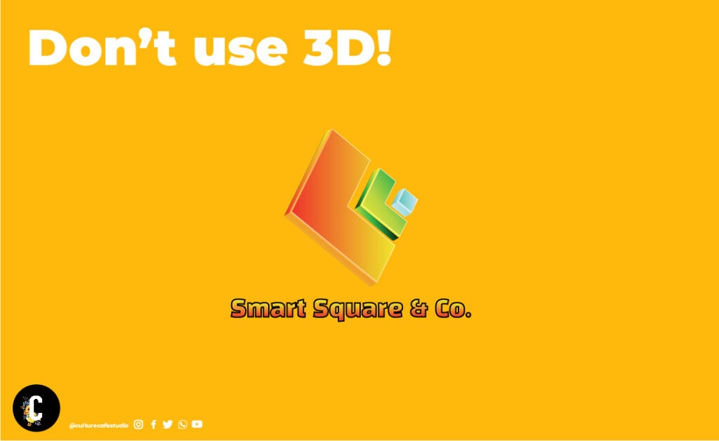
Once upon a time, realistic and 3D rendered logos were considered to be astonishingly attractive. Times have changed and along with it, the trends. Logos now are accepted only if they are:
- Flat
- Without shadows
- Without reflections
- Without gradients (Could be used minimally, depending on the situation)
10. Don’t be too literal
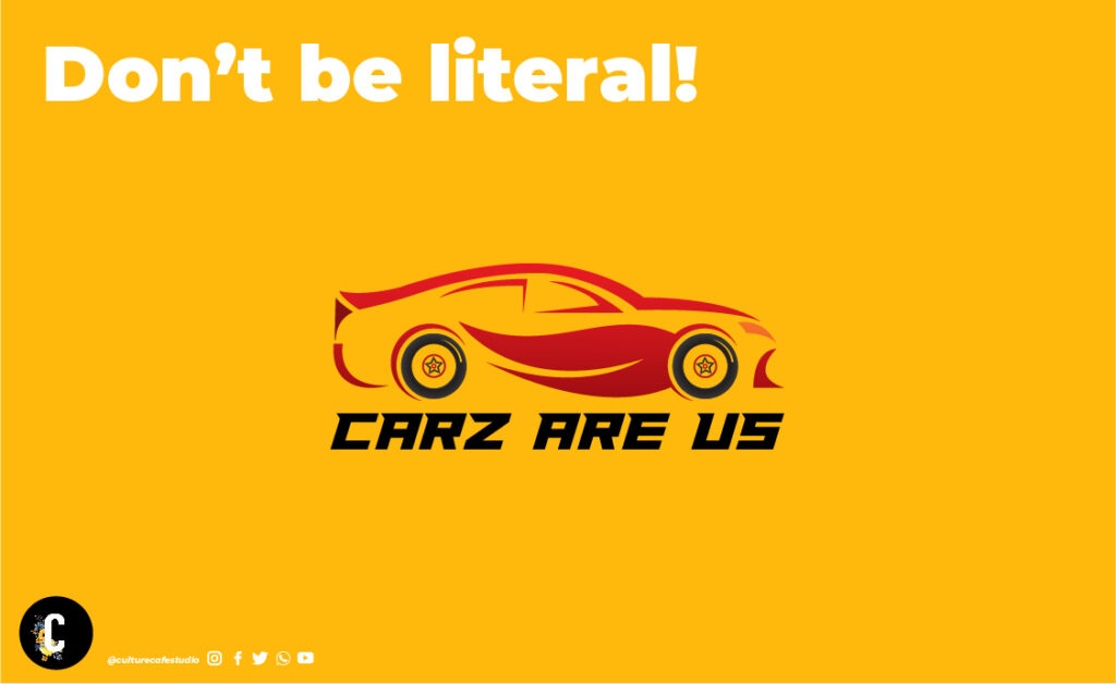
You may be a car dealer. That doesn’t mean you should be using the shape of a car in your logo. That makes your brand look too generic. Instead, you can try to target your visual identity to drive your business. Think about what you want to convey to your customers and how you can leverage it to showcase your values.
Conclusion
These are just some basic guides to getting your logo right. When you know you have chosen the right designer to get your logo done, it can be a very tricky, twisted, confusing, demanding, and difficult journey together to get your logo and branding right. Always remember to have hope & faith in your designer. Give them the space they need to think and process your brand. You have come to them with a problem. Allow them to solve it for you. The result will definitely be worth it.
You can check out our services to know more about what we have to offer.
One of the mantras that we, at Culture Cafe Studio follow is:
“If it is easy, it isn’t good enough!”.

Brilliant work Sarat-Geethu! Proud of you! The content here is absolutely great for anyone to understand the Logo designs. If at all one day I need a Logo for me I know who to contact! Keep up the good stuff!! You’re on the path of glory!
Thank you so much for the kind words Parul! You’re one of the pillars of our success. Your comments are always motivating and give us 10x the power to do more! <3
Great insights about logos! Looking forward for more such content. Good luck!!!
Thank you so much, Hamsa! We will definitely post better content as we move up the experience ladder! <3
Quite an insightful article about logo design / graphic design.! Wish you the very best for all your future projects S&G.! Knock ’em dead.!
Thank you so much, Nirmal! We’re glad you found the content informative! This means a lot to us! <3
Very informative blog Sarat. Looking forward to more. Good luck!
Thank you very much, Mithun! Will definitely update with informative content! <3
Awesome work there team!! Looking forward for more informative blogs!! All the best!! Cheers!!
Thank you so much Sid! You’re awesome! More informative content coming soon!! <3
Very interesting article. Lot of details in there to watch out for getting your all so important logos done.
Very true, Ashok. A logo is there first thing people are going to notice about your Brand. You don’t want it to be anything less than kick-ass! 😉
Very informative and interesting content Sarath Really helpful !! All the very best to you and team for all your future projects 👍👍
Thank so much Sateesh ji! We’re really glad you find this article helpful! We are working on more such topics to help companies and startups be able to take the right decisions on their branding/ visual identity.
This is great! Super helpful! Thanks a lot, guys!
We are glad this helped, Des! You’re Awesome! <3
A well-written, informative article. Keep it up Geetu and Sarat!
Thank you so much Chechi! We’re really glad you found this article helpful! <3 looking forward to providing more of such informative blogs! 🙂
I don’t design logos but this content was too good and very well written with great visuals !
Keep writing more ! Wishing you and your team the best !
Awesome! Thank you so much for the well wishes, Vidya. We will definitely be writing more! 🙂
Awesome blog brother . Got lot of ideas and clarity about logo designing . Existed to see upcoming blogs soon brother.
Thank you so much for your kind words brother! We’re glad you found this helpful! 🙂 Will be posting more informative content in the future! Stay tuned! 🙂 <3
Hey Sarat, very nice and informative article.
Thank you so much Sahil! We’re glad you found it informative! 🙂
This is very informative
Thanks for sharing this
I love you
Thank you so much Yash! We love you too! 🤣🙌🏻🙌🏻
Very informative and interesting content piece Sarath. Clean in understanding – Small Logo but needs Big Attention, got that! 🙂
Thank you Afreen! We’re glad you found it informative and interesting! Hoping to provide you with more such content! <3
This is One Go To Blog for all those important details that makes one’s brand not fall into those traps and make it as professional and brilliant to make it stand out. Brilliant work Sarat & Geethu
Thank you for your awesome words Sarab! You’re totally right. Most companies (esp the startup sector) oversee the value of a logo and its supporting colors. We’re trying to help people understand that one client at a time. 🙂